Short answer: It depends on where, and we need to move beyond looking at cities as the unit of analysis.
2019 to 2020 represented the largest one-year increase in the homicide rate. Preliminary numbers from select cities are also finding that 2021 has not shaped up much better: 12 major cities are on pace to set homicide records with 6 of them breaking their own 2020 record highs.
The debate over violent crime and homicide more specifically in 2020-2021 has played out as expected. Some left-leaning organizations (e.g., CNN, The Brennan Center for Justice) have downplayed it by repeating some variation of “it’s not as bad as the 1980s/early 1990s relatively speaking.” On the other hand, conservative organizations (e.g., The Manhattan Institute) have been sounding the alarm that select cities have either surpassed 1980s/early 1990s totals or are moving eerily close to them.
The cynic in me thinks that peoples’ confirmation biases will be reinforced by each of these two perspectives. And while city-level comparisons can be instructive, I feel the need to share one of the most interesting analyses I’ve seen in the last month or so that disaggregated homicide rates over time across different police districts in Chicago (thanks to Aaron Chalfin for tweeting about it).
On December 13, Roseanna Ander – the Executive Director of the University of Chicago Crime Lab – provided testimony to the Senate Judiciary Committee’s hearing on “Combating Gun Trafficking and Reducing Violence in Chicago” (the video can be found here and her written remarks can be found here).
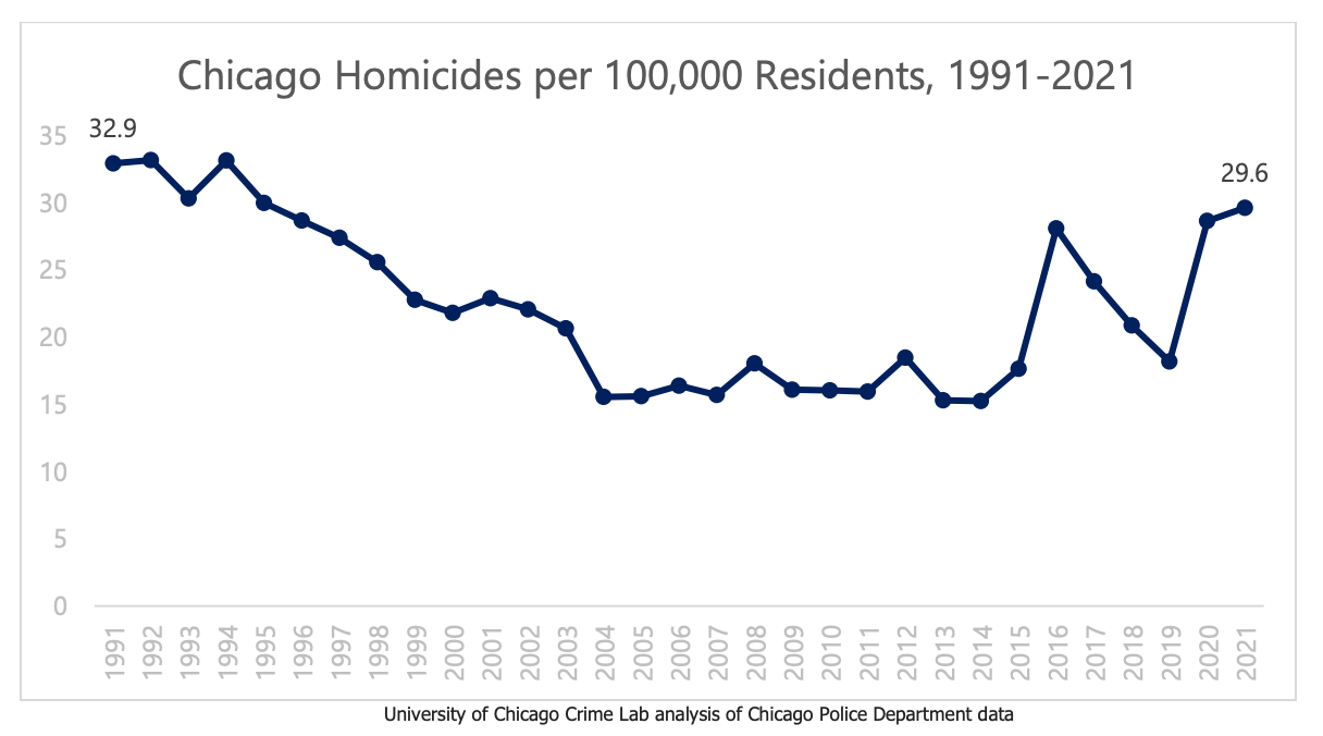
Ander displayed how the 2021 homicide rate in Chicago (29.6 per 100,000) is just shy of the rate in 1991 (32.9 per 100,000) (see below):
However, the aggregate homicide rate for the city as a whole tends to mask glaring and important differences across police districts. Ander then goes on to plot homicide rates across time for the four most and least violent police districts (see below and keep in mind that the Chicago PD has 22 different districts):
Homicide rates in 2020 in the four most violent districts were worse than in 1991 (113.5 per 100,000 versus 86.5 per 100,000). Disparities in homicide rates also intensified between the most and least violent districts from 1991-2020. According to Ander, “In 2020, the gun homicide rate in Chicago’s four most violent police districts was 25 times higher than in the four least violent police districts. In 1991, the rate was 13 times higher – meaning since the ‘90s, the safety gap has doubled in Chicago’s most vulnerable neighborhoods. This disproportionately impacts Black residents.”
This graph and the rates illustrated are deeply troubling. It inspired me to take a deeper dive into whether similar patterns across place hold in New York City.
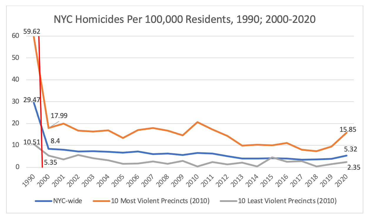
Using official crime data from the New York Police Department (2000-2020) as well as historical homicide numbers (1990) provided by Peter Moskos, I created the following line graphs that plot homicide rates across NYPD precincts over time (1990, 2000-2020). Rates were standardized per 100,000 residents across each precinct based on 2010 estimates from here and here.
Similar to Ander’s work in Chicago, I plotted the city-wide homicide rates as well as the top 10 most and least violent (homicide) precincts in 2010. Here they are:
A few caveats: 1) city-wide homicide rates were standardized based on yearly population estimates from the US Census Bureau and its American Community Surveys. 2) The 87 people killed in the Happy Land fire in the 48th precinct (Bronx) in 1990 were not included in the 1990 homicide rate. 3) Precinct-based homicide rates were based on 2010 population estimates only since that was the only year that I could find (it’s a limitation, I get it). 4) Precinct 22 – Central Park – was excluded from the least violent top 10 list. 5) 1990 represents the highest yearly total for homicides in NYC on record.
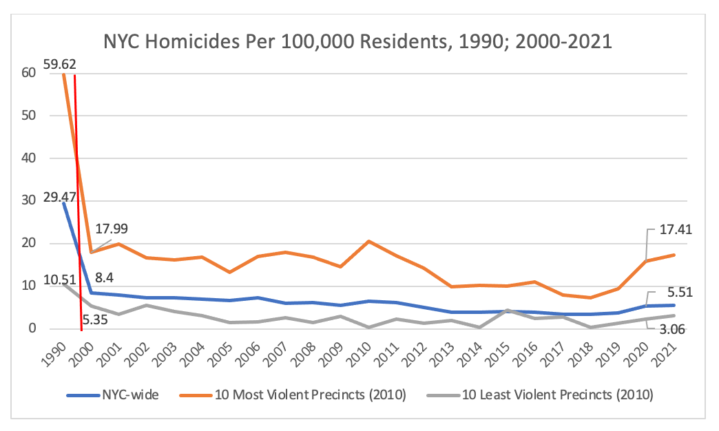
The first figure shows that New York City’s homicide trends are dissimilar from those of Chicago. NYC’s homicide rates over the last few years are, thankfully, nowhere near its 1990 peak (in both the aggregate and among the top 10 most violent precincts). The second figure shows perhaps a more apt comparison between 2000 and 2020. Again, the patterns do not follow those from Chicago: 2020 homicide rates were still lower compared to 2000 – even among the top 10 most violent precincts (15.85 per 100,000 versus 17.99 per 100,000). Yet, it’s important to keep in mind that homicide rates among the top 10 most violent precincts have risen more dramatically over the last few years. The 2000-2020 comparisons also suggest that the disparities between the most and least violent precincts widened over time (similar to Chicago, but certainly not nearly of the same magnitude). In 2020, the homicide rate in NYC’s 10 most violent police precincts was 6.74 times higher than in the 10 least violent police precincts. That rate was 3.36 times higher in 2000.
I call on others to engage in similar types of analyses across time (1980s/early 1990s to present day) using smaller units of analysis (e.g., districts/precincts) in different cities. Perhaps then we can get a better understanding of if and where, geographically, homicides continue to be problematic and potentially worsening in recent years.
**2021 Edit on 1/13/22: the figures below add the 2021 homicide totals. According to NYPD’s CompStat, there were 485 homicides in 2021 (up from 468 in 2020), which raised the homicide rate city-wide to 5.51 per 100,000 (up from 5.32 per 100,000 in 2020). Similar increases were found in the top 10 most and least violent precincts in 2021. The top 10 most violent precincts’ average in 2021 was 17.41 per 100,000 (compared to 15.85 in 2020). The top 10 least violent precincts’ average in 2021 was 3.06 per 100,000 (compared to 2.35 in 2020).


